DESIGNER PROFILE | FOUR DESIGNERS I LOVE AND THEIR NEW FURNITURE COLLECTIONS

This is the year of the interior designer turned maker and I am here for it.

I am so excited to see so many online friends and tastemakers in their field finding new ways to offer us just one more way to access their creative genius in more tangible, functional forms.

I haven’t seen any of these lines in person (yet) but I just know that they are going to offer amazing quality and each of them will be bringing it as they work with furniture designers and manufacturers to showcase their individuality and unique aesthetic.

Let’s get into it, shall we?


CARMEON HAMILTON

Likely no stranger to you, Carmeon entered more of the public eye just before COVID hit as the new Design Star winner. Named a rising star in the design world by Architectural Digest, working with both residential and commercial clients, Carmeon has often made appearances and shares her insights and opinions by way of podcast interviews or panel discussions with major industry associations.

Carmeon is partnering with Tov to bring us some of her best designs via Tov Furniture. Tov Furniture, a manufacturer and retailer of trend-conscious furniture, is launching The Voice Collection at High Point Market, a line created by six Black designers and celebrating the Black design community.

I’m already obsessed.

TOV AYANNA VELVET CHAIR


ERIKA WARD

Erika Hollinshead Ward is the owner and principal designer of Erika Ward Interiors based in Atlanta. She has national spokesperson roles and brand ambassadorships for targeted consumer campaigns. Ward has spearheaded initiatives that rally other designers and vendors to together bring great design to disadvantaged groups. erikaward.com

This year, Erika is also one of the designers Tov is partnering with to bring her own flavor and unique expertise and I just know her collection is going to shine.


CHERYL LUCKETT

Pulling from Southern traditions and her African-American roots, the Cheryl Luckett for Wildwood Collection radiates familiarity and history. Cheryl’s love of fashion, inherited from a family of seamstresses, melds with childhood impressions of artistry that flow through each piece. Her charming designs are tailor-made to infuse decorated spaces with warmth and grace.

“When I design anything, I’m trying to reflect who I am,” says Cheryl. “So, you’ll find a lot of color, pattern and textures like lace, pen shell, and Kuba cloth. There’s a whimsical, yet familiar nature to these pieces. It’s been my honor to cultivate truly treasured homes, and I hope everyone can see themselves in this collection.”

I’m absolutely obsessed with this woman and have followed her on Instagram for years now and have watched her remain consistent while continuing to warm our hearts with not only a energetic smile and genuine heart for encouraging followers to bring their whole selves to the table when pursuing their dreams.


NICOLE CROWDER

Nicole Crowder Upholstery is a modern furniture design and upholstery studio that designs custom furniture and soft furnishings centered on connecting people to themselves and their home space.

I am so excited to see each of these lines in person and possibly even use some of them in upcoming client styling projects.

What furniture lines or designers are you loving lately? Share them in the comments.

xo,

Kennesha

OUR (TINY) BATHROOM REVEAL + NEXT STEPS FOR MORE HOME RENOVATIONS (PART 1)

Well, 2020 brought us a handful of good things.

One of them was a bathroom that we added from extra space in our garage.

Some of you may recall that our home is currently split; with a main home and ADU connected by a deck in the middle. There is living space on the other side (where our garage is located ) and we needed to have another bathroom for our family of 6.

The plan, hopefully in the next year, is to to connect the ADU to the main house and we’re currently working with an architect on those plans, meeting with the city about code restrictions (we’re surrounded by wetland), etc. Y’all can be praying for me. It’s been a ride to say the least.

Anyhow, the bathroom was an “easy” decision and when thinking of ways to make our space more efficient. Our teens needed this space as well so it was somewhat of a no-brainer for us to consider not to mention the overall increased value of the property if and when we decide to place it on the market.

Today, I’m going to begin at the end and show you how it all turned out and work my way backwards which may seem a little counterintuitive but I think splitting this up into parts is best as-with almost any home renovation project-the timeline stretched out quite a bit. (surprise!)

I’ll be back at the end of this week with all the behind the scenes and a full source list for you as well as some budget friendly tips to help you with your next renovation project.

PHOTOGRAPHY | Anna Peters

PHOTOGRAPHY | Anna Peters

We began this project at the very beginning of January 2020 and, as you know, that was when the pandemic began to shift the way we all lived.

I was able to partner with Riad Tile and Clare paint to help pull this all together and I’m so grateful for their support in helping us complete this project.

So, without further ado, I present to you…the (almost) finished bathroom. *record screeches*

Oh, I forgot to tell you? Well, the bathroom isn’t COMPLETELY finished. We still have to wrap the steel I-beam and trim the sides of the sink cabinet.

PHOTOGRAPHY | Anna Peters

PHOTOGRAPHY | Anna Peters

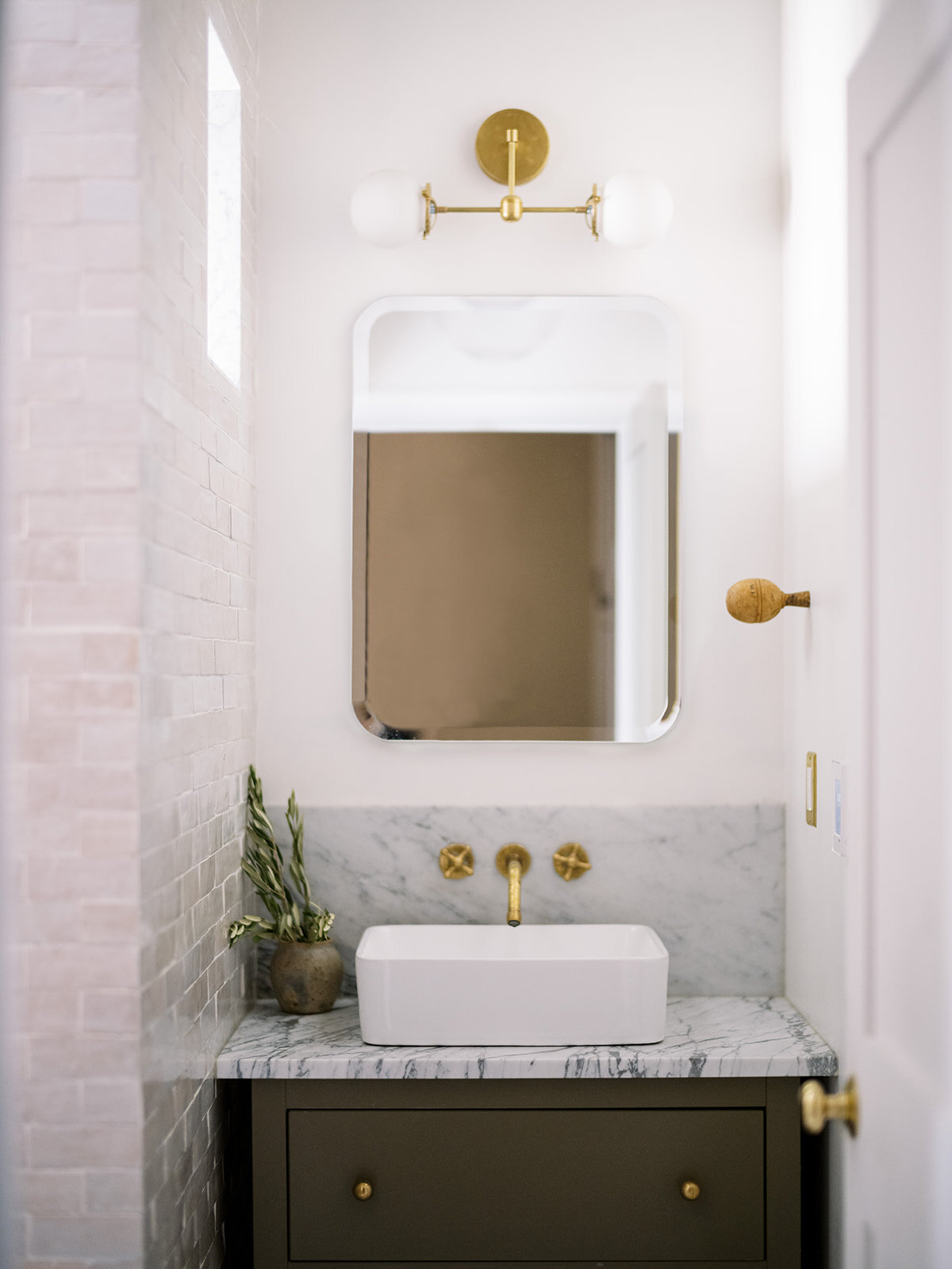
I knew that I wanted Zellige tile in the space and that I wanted it to run its course throughout any future projects that we work on in the home. We hired this tile job out as zellige is somewhat of a booger to work with and the best option was calling in someone who had the expertise and skill to set these properly and give them their due shine.

IMG_7032.JPG

I absolutely love the results. The texture and the color variation makes for some really fun visual interest and keeps the eye moving which is really important in such a tiny space. Every tile is different and I’m not one bit mad about that.

I also knew I wanted brass accents.

The idea in this space conceptually was to mix a bit of old world, classic with modern touches and I think we accomplished that.

I’m so excited to share with you all how we didn’t cut corners and managed to save a lot of money to get the look we wanted (even after the tile partnership).

This bathroom was VERY dark and still is pretty dim throughout the day. The window faces our back yard which is pretty wide open but filled with trees and this side of the house remains pretty shaded so to combat that, instead of a half wall (which posed structural problems) we opted for a cutout to allow light to flow into the other side of the bathroom since there is a shower wall splitting the two sides.

There are still a few things that remain on our to-do list for this space. One of which is closing in the sides of the cabinet (a score BTW, I’ll be sharing more of that on Friday) with trim, wrapping the beam above head and adding the custom curtain rod. I wanted a traditional rod to help the space feel a little more warm and cozy and open and honestly the glass is just not fun to keep clean. Since our teens would have full use of the space, I KNEW that glass just wasn’t a great option here. The linen curtain works perfectly but of course,there’s a little secret behind the source for that, too.

So, there you have it.

The (almost) full reveal of our bathroom addition.

I’ll be on Instagram throughout the rest of this week taking questions and responding to them here on Friday so be sure to join me there to ask all the questions you have about this build and the process/sources.

Love love love to you all and have an amazing rest of your week!

XO,

Kennesha


OUR GREEN-ISH DINING ROOM PAINT COLOR + WHY I LOVE IT

Design is coming to grips with one’s real lifestyle, one’s real place in the world. Rooms should not be put together for show but to nourish one’s well being.
— Albert Hadley
 

Last year sometime around the middle of quarantine, I painted our dining room. It went from a boring cream to the vivrant green you now see. It took a bit of a leap of faith for me to do it but once I began, of course, there was no going back.

PHOTOGRAPHY | Anna Peters     STYLING | Restoration House

PHOTOGRAPHY | Anna Peters STYLING | Restoration House


These walls needed a bit of a makeover as they are cheaply paneled walls and they, along with a handful of other things that the previous owner left behind, are just one of the things I’m looking forward to changing when we begin our major renovation this year. (Keeping my fingers crossed on that timeline)

 
PHOTOGRAPHY | Anna Peters        STYLING | Restoration House

PHOTOGRAPHY | Anna Peters STYLING | Restoration House


I think we all know by now that paint has the power to change a space and make a huge impact with little effort depending on the space and if painting’s not your thing, you can always hire it out to the professionals. I’m especially fond of this upgrade option since it won’t exactly break the bank. I chose this shade of green called “Arrowhead” by Behr and I’ve had absolutely zero regrets about that choice.


PHOTOGRAPHY | Anna Peters STYLING | Restoration House


I’m not sure why I gravitate to green so much. I love using it as an accent throughout our home and my wardrobe’s even full of it. It’s truly a neutral for me.

A couple of years ago I remembered that my memaw (Southern speak for grandmother) favorite color was green.

We had it everywhere, drapes, pillows, sofas, CARPET…it was EVERYWHERE.

Subconsciously there is an emotional connection to the color. She was the woman who raised me and walking into our home-hanging out in that space-definitely makes me think of her. This is just another way I fold my everyday life into more and more of my home story.

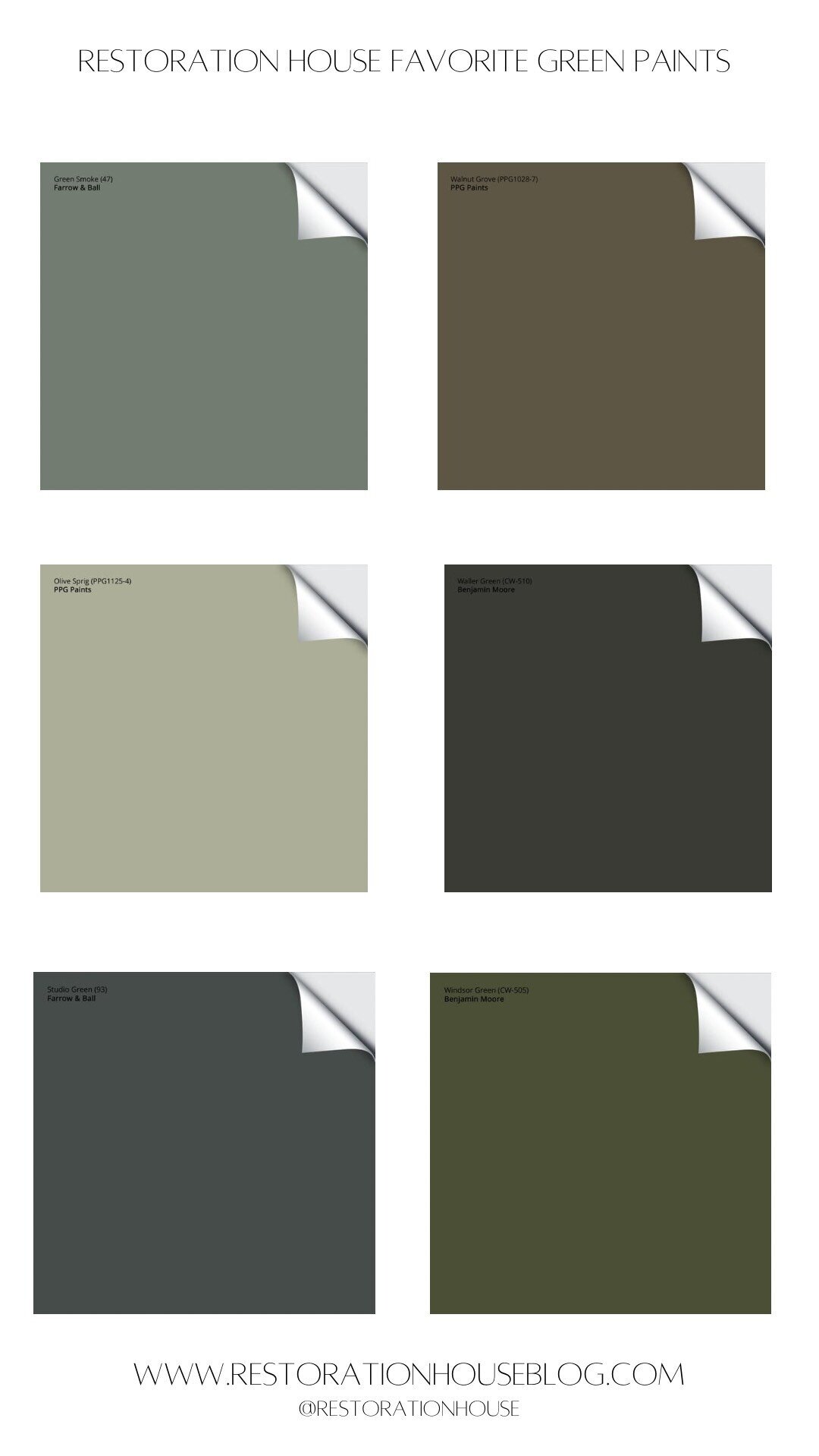
In addition to sharing the color of our dining today, I’m sharing some of my favorite shades of green below. There are just so many that I also love from Clare Paints and Magnolia that I didn’t include images of but they are both at the top of my list of go-to’s.

If you’ve used some of these, I’d love to hear OR if you decided to give one of them a go I’d love to see. Be sure to share with me on Instagram.

95975181-130A-414E-850A-9083893E4E85.jpg
 

Until next time,

XO Kennesha


IMG_0983.JPG

RH SHOP

What beautiful stories will your home tell?

SHOP NOW