home

A LONG OVERDUE BATHROOM REFRESH WITH FERGUSON SHOWROOMS

PHOTOGRAPHY | Marnie Hawson for Lumiere Lodge

PHOTOGRAPHY | Marnie Hawson for Lumiere Lodge

I’ve been off social for a little under a month now and it’s felt glorious.

It hasn’t felt that way just because I’ve been able to have a bit a of a soul reset but also because it’s given me the time I’ve needed to knock some things off of my home project list.

We have plans to renovate our home and to turn it into something that is a bit more functional for our family and lifestyle and we began some of that work last year with the addition of a bathroom to serve our teens who are on a different side of our home that would traditionally serve as an ADU.

The bathroom located in the main part of our home is what guests and our two younger sons currently use and while it’s functional, I’ve wanted to spruce it up a bit for a while so when I got the invitation from Ferguson Showrooms to partner and highlight their Park Harbor line of lighting I thought it’d make for a great opportunity to do just that. ADD THIS LINK http://bit.ly/36xxVaW

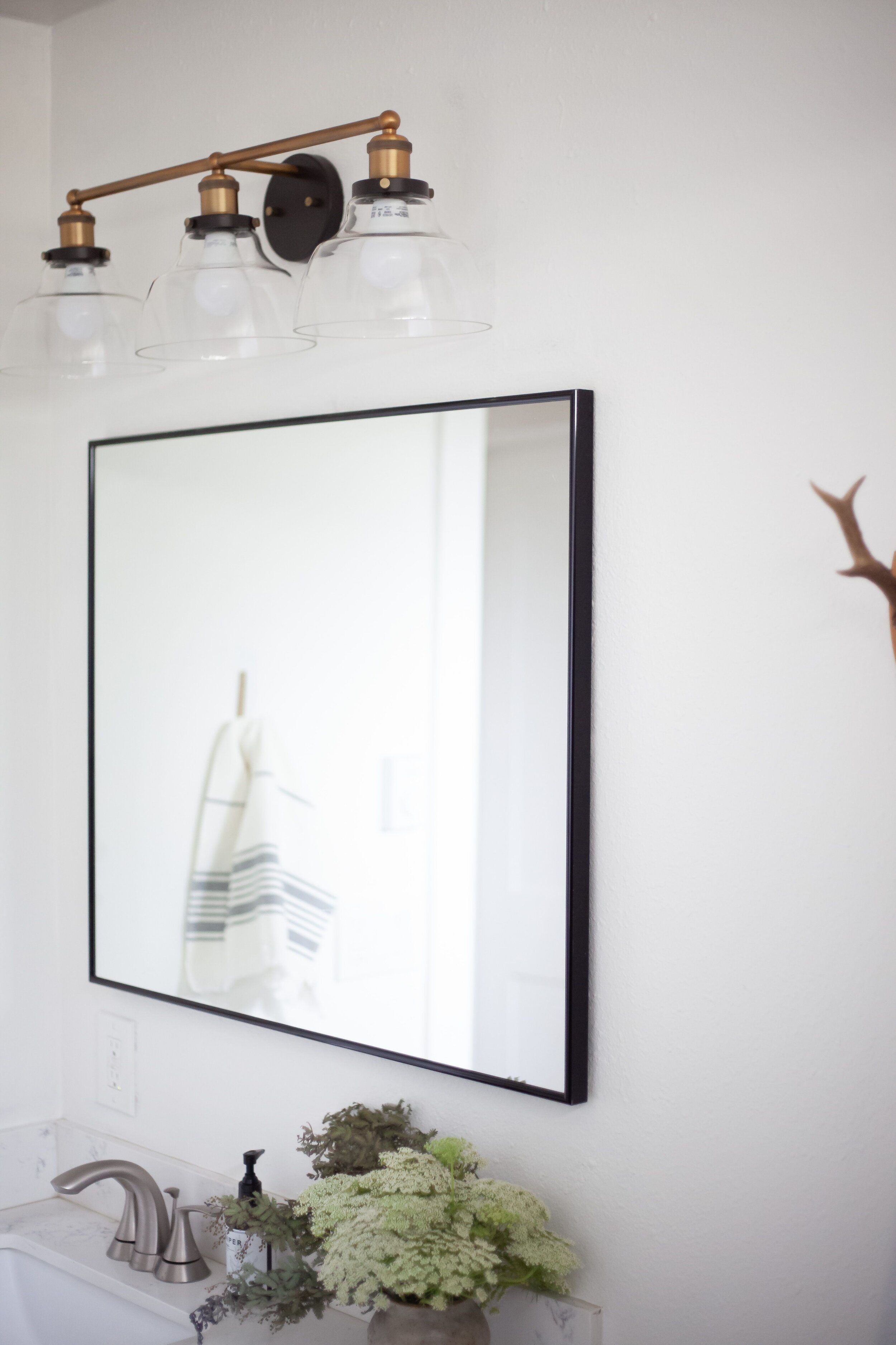
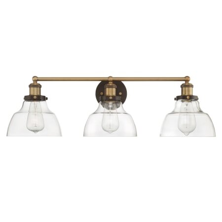
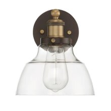
For the bathroom, I selected the Park Harbor Mooretown Vanity Light as it fit well into the traditional lighting I desired for the space and I always love the mixing of brass with dark finishes so it was an easy choice for me in that regard.

IMAGE | Build.com

IMAGE | Build.com

 
ferg1.jpeg

The bathroom before was a dark and dreary place boasting a classic greige paint. Here you can see Larry taking the old lighting down (the worst kind of builder supplied lighting-use your imagination) and you can see the walls here as well.

ferguson7.jpeg

Fast forward to 24 hours later and it’s a literal night and day difference between the former dungeon of a hall bath to a bright, airy new space that feels good to freshen up in each day. Even though my teen son could likely care less, it sure makes me feel good to walk into a space that looks and feels completely different.

ferguson2.jpeg
 
ferguson4.jpeg

I also love when a product is better than expected. I didn’t necessarily have low expectation for the quality of this lighting but I wasn’t sure. This light fully exceeded my expectation and fits perfectly into the scheme of the home as well as functions well in the space.

ferguson6.jpeg

I plan on adding some wainscoting (we just started that last week-stay tuned) on the back wall with a bit of trim to give more visual interest but for now I’ll take the transition that just changing the paint, lighting and mirror offer in this space.

I’m so thankful to have this project checked off my list of home projects and for the opportunity to partner with Ferguson as well. I loved what they had to offer and was pleasantly surprised at how kind and helpful those in the showroom were in helping me sort out what I needed and making it a seamless process from beginning to end.


A FEW WAYS I LOVE REFRESHING A SPACE WHEN THE BUDGET IS LOW

  1. New lighting. I love a good statement light. Whether you’re looking for something simple or a little more conversational, the right light has the power to set the tone in the room OR quite the opposite, as well. When choosing lighting for a space, you want to be sure that it fits the overall scale and style of the room and doesn’t overpower but that it adds to the theme of your home. Not a rule, per se, but a standard of thought I like to follow.

  2. Paint. We’ve all heard it-paint is a great way to instantly change the look and feel of a room. For most spaces, 100 bucks or so can go a long way to accomplish that goal.

  3. Add texture and color. Add a new rug or some throw pillows to a space for a new and fresh look and feel in a room.

  4. Add finishing details. Adding paneling, wainscoting and other trim and finishing details can be one inexpensive way to not only update and refresh a space but it also brings in a bit more character to a room. With minimal effort and a few supplies, this kind of updates can be done by just about anyone.

  5. Replace hardware. Draw pulls, cabinet handles and the like. This doesn’t always end on the low end of the budget but with so many options out there these days for inexpensive pieces, the possibilities are virtually endless.


NOTE: As always, I am always thankful for your support here at Restoration House. This post is sponsored by Ferguson and when you read, share and engage with this and other content I create here on the blog and on social links, I’m better able to create content for this blog as well as support my family. Thank you for supporting what I do here!


xo,

Kennesha


SHOP MORE FROM FERGUSON + PARK HARBOR

Monday Pinterest Picks + A Bathroom Project Plan(ish)

Hey friends!

So , the enneagram 8 (if you wanna know what yours is you ca take the test here) in me just won’t let me settle on this as a plan but the realist in me tells me that in the VERY near future I am going to have to make some solid decisions on what is soon to become a real life project in our home. Ah! Okay, I’m just a little excited because this is the first “large-scale” project we are tackling in this place and I could not wait to sit down and start planning it all out.

I gathered myself a couple of nights ago to set some financial plans, look over the architect’s design and hash it all out via a fresh spreadsheet.

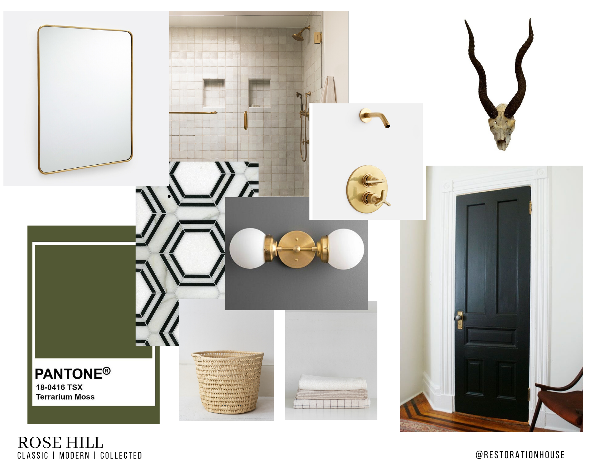
DISCLAIMER: I’ve totally been thinking about this for months and even made this visual 3-4 months ago before we even had approval or the structural design but in my mind, I knew what I wanted so I had to get it all down to get a good look at how it all flowed together. Verdict? I’m in love.

Another disclaimer? Our budget for this build isn’t teeny by any stretch but it’s also not limitless so I’ll be working with a couple of brands to roll this one out but also ensure it’s still a very much approachable design.

WHERE I BEGIN + HOW I GET INSPIRED

I typically kick off any creative process by thinking about ME. What is my personal design style? How do I want the space to feel? What is the function of the space? I know that I will want to mix materials, evoke a sense of collected and found but also keep things clean and classic (our home is a 1940’s cottage so I’d like to stay in keeping with that in some ways). I start flipping through magazines and hop to Pinterest to get the creative juices flowing a bit. This is not a time that I think about budget or that I restrict or limit myself in any way. You could think of this as your typical brainstorming process. This is a time, however, to be inspired but not look at images for the sake of replicating them. In this stage, I am allowing the images to “speak” to me. I am picking apart the things that I love and those that won’t make sense for me and collecting them to form something that will translate well in MY home.

www.restorationhouseblog.com.png

THE (actual-ish) PLAN.

I then narrow down from the original brainstorming to something a little more practical. During this stage I am considering the realities of our finances, collabs, timelines, realistic sources and the functionality of the space. This is also where I will begin to get things down in black and white. At this point, we’ve got all the approvals and permits, locked in the contractor/subs and I have a bit more freedom to begin solidifying what I have envisioned for months.

PROJECT BUYCKS BATH #.png

WHAT I LOVE ABOUT IT:

  • Neutrals with a hint of moody hue.

  • Incorporation of found and antique items. May even repurpose an old piece or two in the space cause, duh.

  • Natural textures and textiles to add a bit of movement and personal style.

WHAT I DON’T LOVE ABOUT IT:

  • Too much brass. Too trendy.

  • The hexagonal tile inspo. Too much contrast between that and the Zellige. Will end up most definitely going with a more neutral tile.

  • Have left nothing to the imagination or for wonder. This is something I feel necessary in every room. Every room (even the bathroom) should leave you feeling inspired IMO.

 
SOURCE | ALL SORTS OF

SOURCE | ALL SORTS OF

THE NEXT STEP:

So, what is the next step, you ask? Well, I am glad you did. I will take the inspiration and some of the pros and cons and find some ways to eliminate what I like the least in order to make the bathroom more of my own. Since this build is for our two teens (and possibly guests/renters in the future) I’ll also get a bit of their input so that they can “own” a bit of the space as well.

After that, I’ll make a final plan. There are some details here that I am certain I’ll be executing: the Riad Zellige tile and the ‘knods"‘ to vintage and found. A must. Everything else is negotiable.

That’s it for now. I cannot wait to share more with you all.

For now, be sure to follow along on my Instagram stories for plenty of behind the scenes and inspiration for just aboutt every room by following me on Pinterest.


Cheers,

Kennesha

BEYOND THE PUMPKIN | A Few Simple Thanksgiving Tablescapes to Get Your Creative Juices Flowing

I’m all for decorating my home and setting the table with things that I already have in my own home. Now, don’t get me wrong, I LOVE buying new things but when I AM buying those things, I typically try to purchase items that are basics and that I can use beyond just one season.

Insert the settings below that check just about every functional and perfect aesthetic for me. I know I am probably one of the few possibly who aren’t celebrating Christmas right now. I actually just love the fall and all it brings and how it evokes and calls to each of us to enter in to a season of rest and opening opportunity for others to enter into that alongside us—especially in our homes.

With that being said, here are a few non-traditional table settings I’ve rounded up to help get your juices flowing. Most of them I chose because they are simple and allow you to gather things around your home that you already have. Whether it’s mismatched flatware or plates, guaranteed you’ve got just what you need to get the party started.

Prepare yourselves, friends. These are pretty good and these ladies did not hold back on creating timeless tablescapes that would no doubt make anyone in the room linger just a little bit longer.

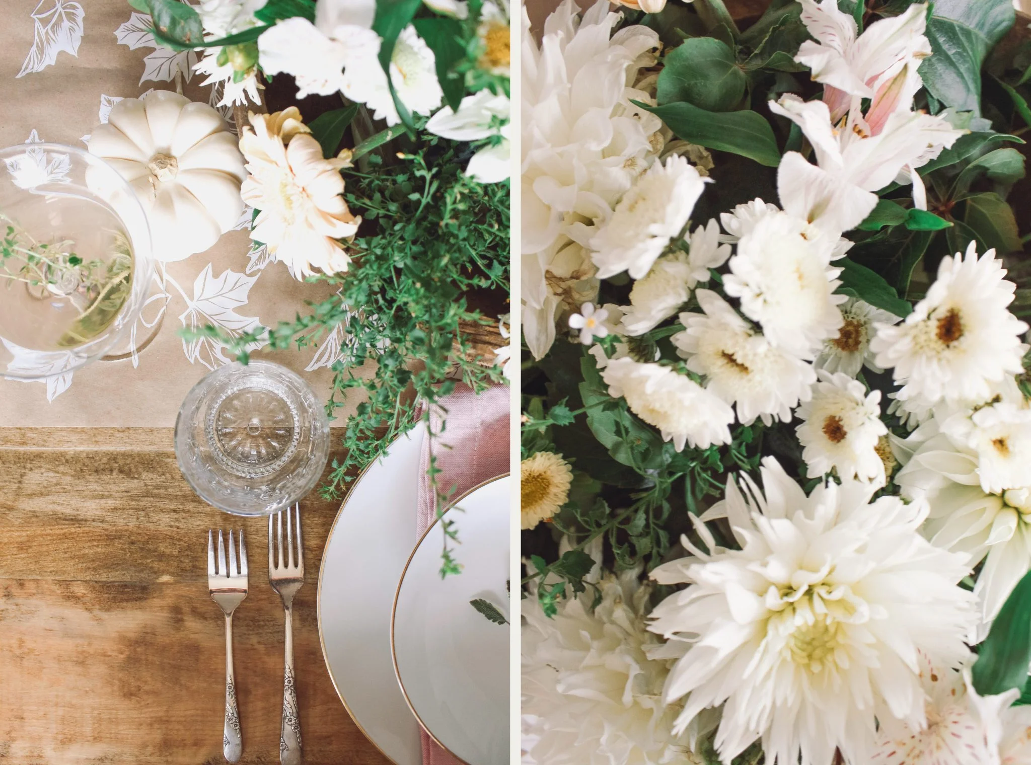
Up first are these two from Apartment 34. I love the '“collected over time” look and feel of these settings. Although I am sure they sourced from some pretty cool artisans, you could also easily duplicate this look by shopping your local thrift and other retailers. I absolutely adore the muted colors and the free flow of the arrangement of the table. Collectively, the setting is frill-free and offers those at the table the ability to be at ease. That’s a feeling I think just about any host would strive for. These (above and below) get the thumbs up from me, for sure.

via Rip + Tan

Jenni Kayne (above) has been a fave of mine for a few years now and each season she consistently delivers loads of inspiration for home. This one’s from a couple of years back but because of the timeless style she offers, it’s still relevant

Always a fan of the the contrast that a darker bottom layer brings, this tablescape from Rose and Ivy surely delivers a very traditional punch with a twist. By simply placing the pear on the setting with the cloth napkin not only are you giving opportunity for a “one-stop shop” of sorts for those dining with you but you give the eye somewhere to go which makes guests feel more entertained (crazy how our brains work) and also adds visual interest to the table. This idea continues with the texture of the florals and the ornateness of the gold flatware, the scallop of the plates and even the texture of the bread board. That addition also breaks up the traditional feel and gives the table more of a modern feel. To see more, just click on the link the image caption.

Give me muted colors ALL day. I’m a happy girl. This table from House of Perez is surely on my short list of favorites. What I love about going with non-traditional colors and decor is that you don’t have to box yourself in to only using them during a specific time of year and, in this case, the fall. Choosing this option also allows you to save money in the long run as you’re not making seasonal purchases. For most of us, little things like saving money in places like this matter. So, in that case, I’ll consider that a win for us all.

Speaking of muted colors, this simple and minimal tablescape nearly stopped me dead in my tracks. And, these plates, guys. My goodness. There’s not one aspect of this table I’m not in love with. If I had to choose a favorite I think those rust orange cloth napkins may be my most favorite thing on this table. This one was pulled together for wedding inspirational purposes but I love that it can absolutely stretch far beyond that in usage.

So, not I wanna know…are you decorating your table for fall or do you save all of your energy for Christmas decor and entertaining? What’s your favorite tablescape above? I hope you’ve been inspired to think a little out of the box and past pumpkins if you are one of those who plans on setting a nice, fun table for Thanksgiving. Lemme know in the comments below and happy, happy decorating, friends!

xo

Kennesha